![]() Wow. Don’t read this. Just go get the new EMC Syncplicity iPhone client now. It’s amazing. It isn’t so much as a sync and share app as it is a sexy remote control for enterprise document management policies.
Wow. Don’t read this. Just go get the new EMC Syncplicity iPhone client now. It’s amazing. It isn’t so much as a sync and share app as it is a sexy remote control for enterprise document management policies.
It’s better than Finder.
Sure, it does enterprise grade sync and share, allowing users to securely collaborate with each other ad hoc, and corporate to push down their own folders of content.
Sure, without having to rely on “the magic folder” into which you put all of the stuff to be synced, it acts very much like the easiest backup and recovery client around.
Sure, it’s at the top right of Gartner’s Magic Quadrant (TM Gartner). (Dropbox was not top-right)
Sure, it allows your teams to find each other’s content by gravatar (if you can’t quite remember their name.
Sure, it adds native PDF and M$oft document annotation capabilities, and lets me add new slides to my powerpoint while traveling.
Sure, it adds contextual menu options to keep clutter out of the interface, while exposing an extremely powerful set of document management tools.
Sure, it provides intelligent insights to recognize (for instance) by looking at your calendar, that you were just in a meeting, and have been creating documents. Would you like to share this document with the meeting participants? (and it pre-populates the email with their addresses).
Sure, it tracks who’s looking at the shared links you provide, and lets you track who is downloading your content and from where in the world (plotted on a map).
Yes, it has all that, but, man is it a sexy app to use! I just loaded it onto my phone, and I swear I think I can navigate my folder tree on my phone better than I can in Finder on the Mac.
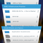
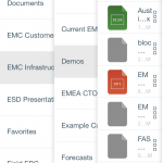
What it does is provide a continual context for where you are in the folder tree by using the “cards” interface more commonly in use these days.  All parent folders are cards that can be viewed by “riffling the deck from above” or by “fanning the cards” left to right.
I love that when you “fan the cards” the parent card UI is active, in  that you can scroll down and jump straight into another folder without first having to “select that card, and then start scrolling”.
A few screenshots don’t really do it justice, so check out this UI video.
Great job Syncplicity. You got this one right!
codemore code
~~~~